[another] new look
19 February 2008
This blog is just one part of a larger site that covers the life of Alice and I. The design of it has been evolving (I never seem to stay content) but it was more my site and the look reflected it. It looked like an architect's site- a little too clean, trying to be too cool. So I'm trying to make it more personable and something that Alice will like too. I experimented around with the pet sketches last week and she liked it. I didn't like the colors or the rigidness of it, but the site was heading in the right direction. I've liked the unfolding box logo on this site and the transparent greens... Now I think I've got something that will hit a good middle ground:![]() I should be loading it all up tonight, so check it out and let me know what you guys think.
I should be loading it all up tonight, so check it out and let me know what you guys think.
3 comments:
Cam and I love it too! It's perfect :). Cam says he loves how Bob is colored in (and looking straight at his master). WE LOVE YOU!!!!......Sarah
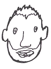
um so which face is you? are you the one with pointy ears on the left or right? i like the music page and the new home page and logo. impressive. did you use mario paint or microsoft paint? i kid i kid. i think i would give this 8 out of 10 wigs. wait, i'm so confused, all this blogging, it's getting to me. who am i? what am i? where am i navigating next!?


i love it christopher!