new site
17 January 2011
I may resume posting personal thoughts here, but a lot of my focus will be over at the APPALACH Design Workshop site, so be sure to check it out.

the future?
11 August 2010

Daydreaming and messing around with with logo and name concepts for my possible future firm. "Appalach" is the fictional root word of the mountains I love. I've used it around the internets for a while a user name and it's become a familiar alias, so why not? The logo is supposed to be a folded plane (a design motif I love) and also an abstraction of the way our mountain ridges line up in ascending blues on a clear day. I like "workshop"- it has a hands-on connotation. And hopefully I would offer contracting and fabrication services as well as design, so I thought it'd be appropriate. I see a drafting table next to a table saw... my kind of firm.
cool student project video
05 June 2010
Interesting integrated concept- I love the idea of intelligently recontextualizing a strip mall. Also, the best integration of computer modeling and sketch diagrams I've seen yet. Really gives you a good feel for the process they went through. And make sure watch the very end- I really hope they included that in the presentation to their professors. I would have loved to present a project this way in school.
cul-bama
06 May 2010


![]()
I forgot about this one. A while back my friend Cullin ran as a write in candidate for Knox County Comissioner. I made this graphic for him, parodying that iconic Obama graphic, which in turn imitated this one.
where to bridge?
15 April 2010
An article of mine originally posted at notawigshop.com:
It looks like Knoxville is getting a pedestrian bridge. For a river city, we have amazingly few ways to cross it. It seems that generations of Knoxvillians were content to stay on the north side of the river. That's changing with the South Waterfront Plan, which will essentially create a southern half to downtown. Part of that plan is a pedestrian bridge, a la the Walnut Street Bridge in Chattanooga.
I'm all for it. I think if the city does it right, a beautiful new bridge could become as iconic to the city as the Sunsphere is. So the concept is sound, but where to put it? Mr. Flory has (rightfully) questioned the usefulness of the proposed site by UT campus. Given our river bluff topography and a plethora of obstacles (City/County Building, Baptist Hospital, UT Stadium/Arena), placing a bridge that works with downtown is a difficult task. But let's try it!
Blue shows our existing bridges, orange shows the "passes" that allow approaches through the South Knoxville hills, and red (labeled 1) is the proposed site. There are advantages and disadvantages to T-B Arena site, which I encourage you to discuss in the comments. However I would like to focus on a few alternatives here.
#2 Make the downtown pedestrian bridge connect to, you know, downtown. We could put it in between our two major bridges. All we'd have to do is tear down the City/County Building and the Baptist Hospital Complex. Yeah! As awesome as that would be, it's pretty improbable. Moving on...
#3 The bluff to the east of First Creek offers an interesting possibility. The north approach would be by the touristy part of town with James White Fort and the Hall of Fame. On the south side it would more intimately interact with the South Waterfront (something you can't say about the Scottish Pike neighborhood), terminating either at the unoccupied mound that Sevier Ave splits around (which would make a nice park) or centrally where Davenport Road comes over the ridge. There'd be some tricky threading by Ruth's Chris and those condos, but I think that'll be true of the T-B arena site also.
#4 Maplehurst to Blount Ave. There's an old railroad bridge there currently, but in the South Waterfront meetings it was confirmed that only ONE train a day uses it. This is the same track that awkwardly bisects Worlds Fair Park. The approaches on both sides are worked out- so we could either rehab the old bridge (like Chattanooga's Walnut Street and much cheaper) or dismantle the bridge and build the new one in its place. We might even be able to reuse the concrete piers (keeping cost down), something like this:
It would connect to a vibrant downtown neighborhood, the railroad right of way would easily connect its path to Worlds Fair Park and the Greenway system, and its southern approach would be much more central to the South Waterfront.
You can probably tell where I'm leaning. What do you think? Where would our pedestrian bridge be best placed?
Update:
OK, one more map. But first, a caveat: This bridge will be wonderful and scenic no matter where it's placed. What it's like over the water doesn't bother me, it's what happens at the ends that needs more thought.
The issue is our unusual topography. We're a river bluff city, with the occasional creek gorge separating elements (most significantly campus and downtown). What if the northern approach of was extended and more integral?
The bridge could come in at bluff level (with a side connection to Maplehurst) and "T" into ANOTHER bridge that bridges the Second Creek gap between the Hill and Downtown! This second bridge would tie into the 11th Street Garage bridge on its western end and into the Convention Center on the other.
At a convention? Want to see the river? Just walk down the elegant bridge between the old bluff neighborhood and the stately University. Suddenly the bluff drops away and the hills across the river reflect in its glassy surface. I can see it in my mind's eye...
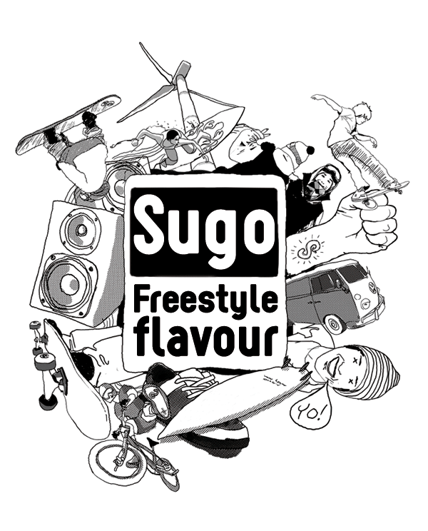
in praise of sugo
26 January 2010
Right now I'm helping the Friends of Fort Liberte, the non-profit I work with in Haiti, rebrand its identity. I started with an icon of the town, the entry arch, and abstracted it into a logo that hopefully will translate equally well into web, print, and apparel. Below is the second draft:
There's been positive feedback on Facebook, and lots of people seemed to like the font I used so I thought I'd put some info about it here. It's called "Sugo" and it's available for free at dafont.com. Dafont has been the best typeface resource I've been able to find on the interwebs. Most of the stuff uploaded there is terrible, but there are many diamonds in the rough. I'd recommend to anyone working on graphics to look through their catalog- and you can't beat the price!
Enjoy.


